Website design and WordPress SEO
Responsive CSS Without Media Queries: clamp() and Grid
Responsive CSS without media queries: fluid type and spacing with clamp(), grids that wrap with auto-fit and minmax(), and the zoom check…
Read article
This guide is for site owners, designers and WordPress developers who want images that look sharp on every screen without slowing the page down or confusing search engines. You will learn how srcset and sizes work, what Google says about responsive images SEO, and how the same markup helps your Core Web Vitals.
Responsive images let the browser download a file that fits the screen, using srcset to list sizes and sizes to describe the layout. Google supports srcset and the picture element but recommends a src fallback, because some crawlers do not read them. Add width and height, and never lazy-load the main image at the top.
Google supports responsive images, but asks you to keep a normal src as well. Its image SEO best practices say: “Web pages use the <picture> element or the srcset attribute of an img element to specify responsive images. However, some browsers and crawlers don’t understand these attributes. We recommend that you always specify a fallback URL using the src attribute.”
The same page explains what Google can find. “Google can find images in src attribute of <img> element”, while “Google doesn’t index CSS images”, so a hero picture set as a CSS background will not appear in image search. Google indexes BMP, GIF, JPEG, PNG, WebP, SVG and AVIF, and advises that the file extension should match the file type. Responsive markup does not change the other basics: a descriptive file name, as covered in my guide to image file names for SEO, and useful alt text.
srcset lists the available files and sizes tells the browser how wide the image will display, so it can choose a file before the layout is calculated. Each file gets a descriptor. A w descriptor states its real pixel width, as in hero-800.jpg 800w. An x descriptor states the screen density it is made for, as in logo-400.png 2x.
The sizes attribute is a list of media conditions and slot widths, such as (max-width: 600px) 100vw, 800px. MDN’s responsive images guide warns that “the browser ignores everything after the first matching condition, so be careful how you order the media conditions”. If you leave sizes out, the browser assumes 100vw, the full screen width. The table shows when to use each approach.
| Approach | Markup | Best for | Needs sizes? |
|---|---|---|---|
| Width descriptors | srcset=”hero-480.jpg 480w, hero-800.jpg 800w” | Images that change size with the layout | Yes, or the browser assumes 100vw |
| Density descriptors | srcset=”logo.png 1x, logo-2x.png 2x” | Fixed size images such as logos | No |
| picture with type | <source type=”image/avif” srcset=”…”> | Newer formats with a fallback | Yes, on each source with w descriptors |
| picture with media | <source media=”(max-width: 600px)” srcset=”…”> | Different crops for small screens | Yes, with w descriptors |
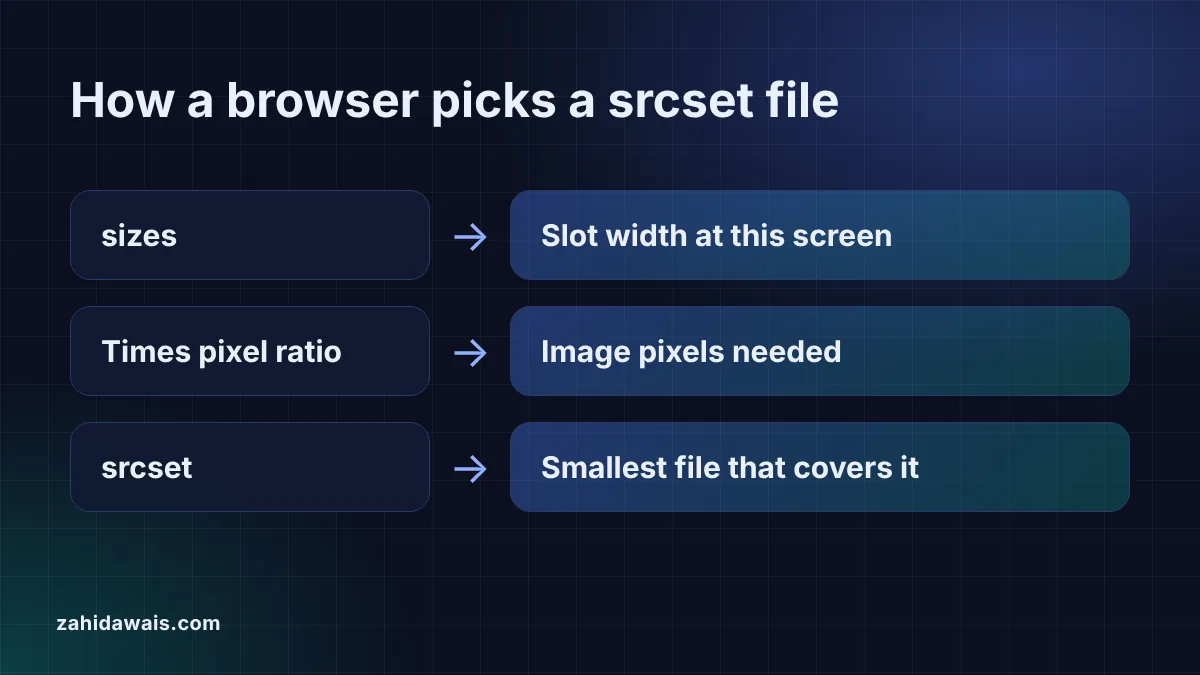
The browser takes the slot width from sizes, multiplies it by the device pixel ratio and normally picks the smallest file that covers the result. On a 390px wide phone with a pixel ratio of 2 and a 100vw slot, it needs 780 image pixels, so an 800w file wins over a 480w file.
The final choice belongs to the browser. The HTML standard tells it to “choose one image source” in “an implementation-defined manner”, and lets it consider network conditions, so a cached larger file may be reused. The srcset generator includes a preview that shows the usual choice for any screen width and pixel ratio, labelled as an approximation for that reason.
Responsive images help Largest Contentful Paint because smaller files arrive sooner, and their width and height attributes protect Cumulative Layout Shift. web.dev says a good LCP is 2.5 seconds or less, and an img element is one of the element types LCP measures, so the hero image is often the LCP element.
Three attributes matter most for that image. web.dev recommends fetchpriority="high" “to boost the priority of the LCP or other critical images”, warns “Don’t lazy-load images that are likely to be in-viewport when the page loads, especially LCP images”, and says “Always include width and height size attributes on your images and video elements”. A good CLS is 0.1 or less. If you run WordPress, my guide on how to reduce LCP in WordPress covers the theme and plugin side.
Use picture when you want to offer AVIF or WebP with a JPEG or PNG fallback, or a different crop on small screens. Each source carries a type such as image/avif, and the browser skips any source whose type it does not support, then falls back to the img inside.
Google’s image guidance asks you to “make sure that you provide an img element as a fallback with a src attribute when using the picture element”. Because Google supports WebP and AVIF in a plain img src as well, a single modern format can skip picture altogether. The JPG to WebP converter makes the WebP versions, and the image resizer exports each width you list in srcset.
Build the layout with placeholder images at the final sizes, then swap in the real photos. The placeholder image generator makes a labelled image for every width in your srcset, for example 480, 800, 1200 and 1600 pixels at a 16:9 ratio, so you can check which file loads at each breakpoint in your browser’s network panel.
Keep placeholders out of the live site. A grey box tells search engines and visitors nothing, so replace each one with the real image, a descriptive file name and alt text before launch.
Example: a blog hero image exported at 480, 800, 1200 and 1600 pixels wide from a 1600 by 900 original. It fills the screen on phones up to 600px, takes half the screen up to 1024px and is 800px wide on larger screens, so sizes is (max-width: 600px) 100vw, (max-width: 1024px) 50vw, 800px. The srcset generator outputs the fallback hero-800.jpg with width="800" height="450". On a 390px phone at a pixel ratio of 2, the preview shows a 390px slot and picks the 800w file. On a 1440px laptop at a pixel ratio of 2 the slot is 800px and it picks 1600w. Because this image is at the top of the page, it gets fetchpriority="high" and no lazy loading.
srcset is not a ranking factor in itself, but it helps pages load the right file faster, which supports a good LCP. Google supports srcset and the picture element, and recommends keeping a src fallback because some crawlers do not read them.
Google’s image guidance does not say which srcset candidate it indexes. What it does say is to always include a src attribute, so make the src file a good quality version with a descriptive file name, and keep alt text on the img element.
Lazy-load images below the fold only. web.dev warns against lazy loading images that are likely to be visible when the page loads, especially the LCP image. Give that image fetchpriority high and keep width and height on every image.
Three to five sizes cover most layouts, and web.dev notes that serving 3 to 5 sizes is common. Include a width close to the largest slot at a pixel ratio of 2, and never export widths larger than the original.
Yes. srcset only lists file versions; the alt attribute on the img element describes the image. Google says alt text is the most important attribute for image metadata, and it helps people using screen readers.
You can, but Google says it does not index CSS images, so a background image will not appear in Google Images. Use an img element with srcset and alt text for any picture that matters for search or understanding.
This guide is part of my Core Web Vitals guide.
Checked 23 Oct 2026. Facts checked against these official pages. Read how I check facts in my editorial policy.
Want a fast site with images that load the right size on every screen? See my website design service.
Responsive CSS without media queries: fluid type and spacing with clamp(), grids that wrap with auto-fit and minmax(), and the zoom check…
Read article
Password protection, noindex headers and the Discourage setting compared, plus how to clean up a staging site that already leaked.
Read article
Thirty practical checks I run on every new WordPress site, grouped so you can fix the biggest risks first.
Read articleSend your website and I will reply with a free audit.