Image Resizer
An image resizer is a tool that redraws an image at a new pixel size. With the aspect ratio locked it scales…
Enter one file name pattern and the widths you have, and get responsive img or picture markup with srcset, sizes, width and height, plus a preview of the file a browser would pick.
Nothing you type leaves your browser. The preview follows the selection steps in the HTML standard; real browsers may also weigh cache and network.
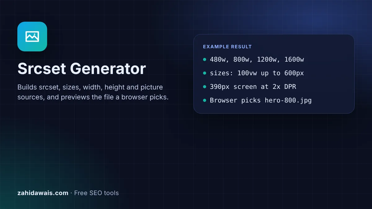
The free srcset generator builds responsive image markup from one file name pattern and the widths you have: srcset, sizes, width and height, and optional AVIF and WebP sources in a picture element. It also previews which file a browser would pick. Everything runs in your browser.
A srcset generator writes the srcset and sizes attributes that let a browser choose the right file for each screen. List each file with its real width in w units, describe how wide the image displays in sizes, and keep a src fallback, which Google recommends because some browsers and crawlers do not read srcset.
srcset and sizes are attributes of the HTML img element that offer the browser several versions of the same image. srcset lists the files, each with a descriptor. sizes tells the browser how wide the image will be shown at different screen widths, so it can pick a file before the page layout is ready.
MDN's img reference says a width descriptor "must match the intrinsic width of the referenced image", and that "the width descriptor is divided by the source size given in the sizes attribute to calculate the effective pixel density". If sizes is missing, it defaults to 100vw, the full screen width, so the browser may download a much bigger file than a small slot needs. Google supports both approaches for image search, and its image SEO best practices add one rule: "always specify a fallback URL using the src attribute".
A w descriptor states the real pixel width of each file and needs a sizes attribute, while an x descriptor states the screen pixel density each file is for and suits images shown at a fixed size. MDN describes the x descriptor as the "condition in which the corresponding image resource should be used as the display's pixel density", so 2x targets screens with two device pixels per CSS pixel.
Use w for anything that changes size with the layout, such as hero images, article images and product photos. Use x for logos and icons that always display at, say, 200px wide. Do not mix the two: MDN says "it is incorrect to mix width descriptors and pixel density descriptors in the same srcset attribute", and duplicate descriptors are invalid as well.
The browser finds the slot width from the first sizes condition that matches the screen, multiplies it by the device pixel ratio, and usually takes the smallest file that covers that many pixels. The HTML standard converts each width into a density with "the width descriptor value divided by source size", then says the browser should, "in an implementation-defined manner, choose one image source".
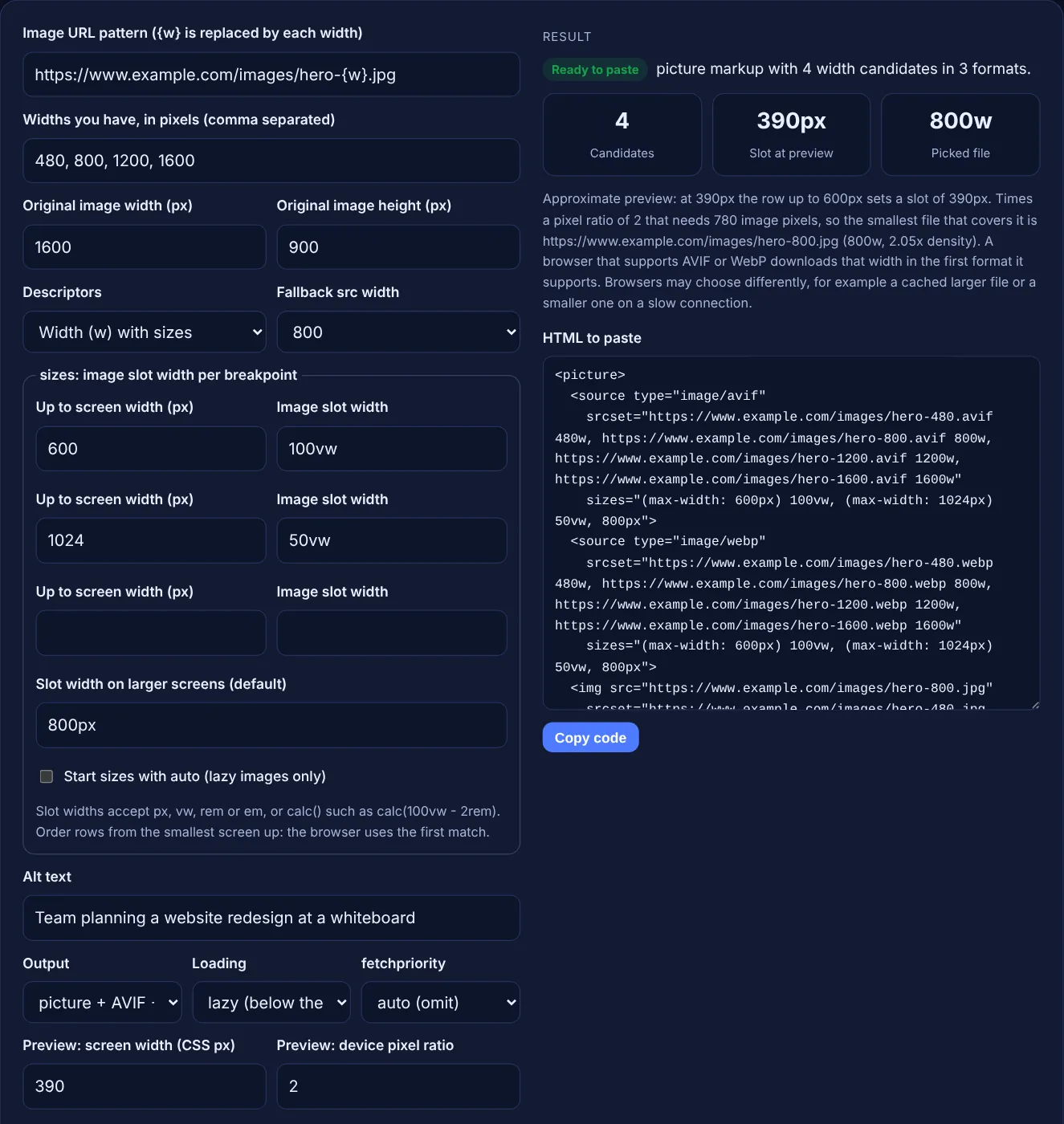
That freedom is why the preview in this tool is an approximation. A browser may reuse a larger file it already has in its cache, and the standard lets it weigh "the user's network conditions". The preview shows the normal case, which is the one to plan for: on a 390px phone at a pixel ratio of 2 with a 100vw slot, the browser needs 780 image pixels, so an 800w file is picked.
width and height let the browser reserve space before the file loads, which prevents layout shift, and fetchpriority high helps the main image load sooner. web.dev's guide to optimising CLS says: "Always include width and height size attributes on your images and video elements." The values set the aspect ratio, so use the size of the fallback file and keep every file in srcset at the same ratio.
For the image most likely to be the Largest Contentful Paint element, web.dev recommends fetchpriority="high" and warns: "Don't lazy-load images that are likely to be in-viewport when the page loads, especially LCP images." A good LCP is 2.5 seconds or less. Images further down the page should use loading="lazy" and the default priority.
| Attribute or element | What it does | When to use it |
|---|---|---|
| srcset with w | Lists files by real pixel width | Images that change size with the layout |
| srcset with x | Lists files by screen density (1x, 2x) | Images shown at one fixed size, such as logos |
| sizes | Slot width per breakpoint; defaults to 100vw | Always with w descriptors |
| src | Fallback file for browsers and crawlers | Always; Google recommends it |
| width and height | Reserve space, set the aspect ratio | Every image, to prevent layout shift |
| loading="lazy" | Waits until the image is near the viewport | Images below the fold only |
| fetchpriority="high" | Fetches the image before other images | The main image at the top, often the LCP image |
| picture with source type | Offers AVIF or WebP, skipped if unsupported | When you serve newer formats with a JPEG or PNG fallback |
Example: a blog hero image exported at 480, 800, 1200 and 1600 pixels wide from a 1600 by 900 original. It fills the screen on phones up to 600px, takes half the screen up to 1024px and is 800px wide on larger screens. With the default values above, the tool outputs a picture element with AVIF and WebP sources and an img with 4 candidates, sizes="(max-width: 600px) 100vw, (max-width: 1024px) 50vw, 800px", the fallback hero-800.jpg and width="800" height="450". On a 390px phone at a pixel ratio of 2 the preview shows a 390px slot and picks the 800w file. Change the preview to 1440px and 2 and it picks 1600w.
Three to five widths cover most layouts. web.dev notes that it is common to serve 3 to 5 different sizes of an image. Include one width close to the largest slot at a pixel ratio of 2, and do not export widths larger than the original.
Yes, in practice. Without sizes the browser assumes the image is 100vw, the full screen width, and on a wide screen it may download your largest file for a small sidebar image. Write sizes to match your real layout.
It tells the browser to use the image's real layout width instead of your list. MDN says it is only valid with loading lazy. Keep your normal sizes list after auto as a fallback for browsers that do not support it.
No. Use picture when you serve AVIF or WebP with a JPEG or PNG fallback, or when you crop differently for small screens. Google supports WebP and AVIF in a plain img src too, so one modern format can skip picture.
The HTML standard lets each browser choose in its own way. It may reuse a larger file from its cache or pick a smaller one on a slow connection. The preview shows the usual choice, which is the one to plan your widths around.
No. The generator runs entirely in your browser with JavaScript. The URLs you enter are only used to write the markup and are never requested, so you can plan images for a site that is not live yet.
Checked 23 Oct 2026. Facts checked against these official pages. Read how I check facts in my editorial policy.
An image resizer is a tool that redraws an image at a new pixel size. With the aspect ratio locked it scales…
A JPG to WebP converter is a tool that re-encodes JPG or PNG images as WebP, a format made by Google that…
Draws sized placeholder images with a label; download PNG, JPEG or WebP, or copy SVG.
An aspect ratio calculator is a tool that simplifies width and height into a ratio such as 16:9 by dividing…
Send your website and I will check it for you, free.
One short email when something new goes live: articles, free SEO tools, package updates, discounts and price alerts. No spam, unsubscribe in one click.