Open Graph Preview
An open graph preview is a mockup of the link card social platforms build from your Open Graph meta tags. The…
Find the ratio of any image or video and calculate the missing width or height.
The free aspect ratio calculator runs in your browser, needs no sign-up and never sends what you type anywhere.
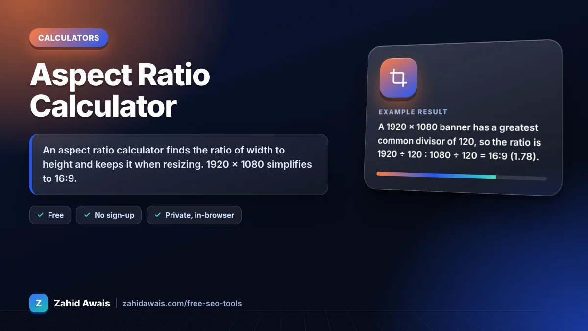
An aspect ratio calculator finds the ratio of width to height and keeps it when resizing. 1920 × 1080 simplifies to 16:9. New height = new width × original height ÷ original width, so 1280 wide gives 720 high. Set width and height attributes on images so browsers reserve space and avoid layout shift.
An aspect ratio calculator is a tool that simplifies width and height into a ratio such as 16:9 by dividing both by their greatest common divisor. It then scales one side with new height = new width × height ÷ width to resize without stretching.
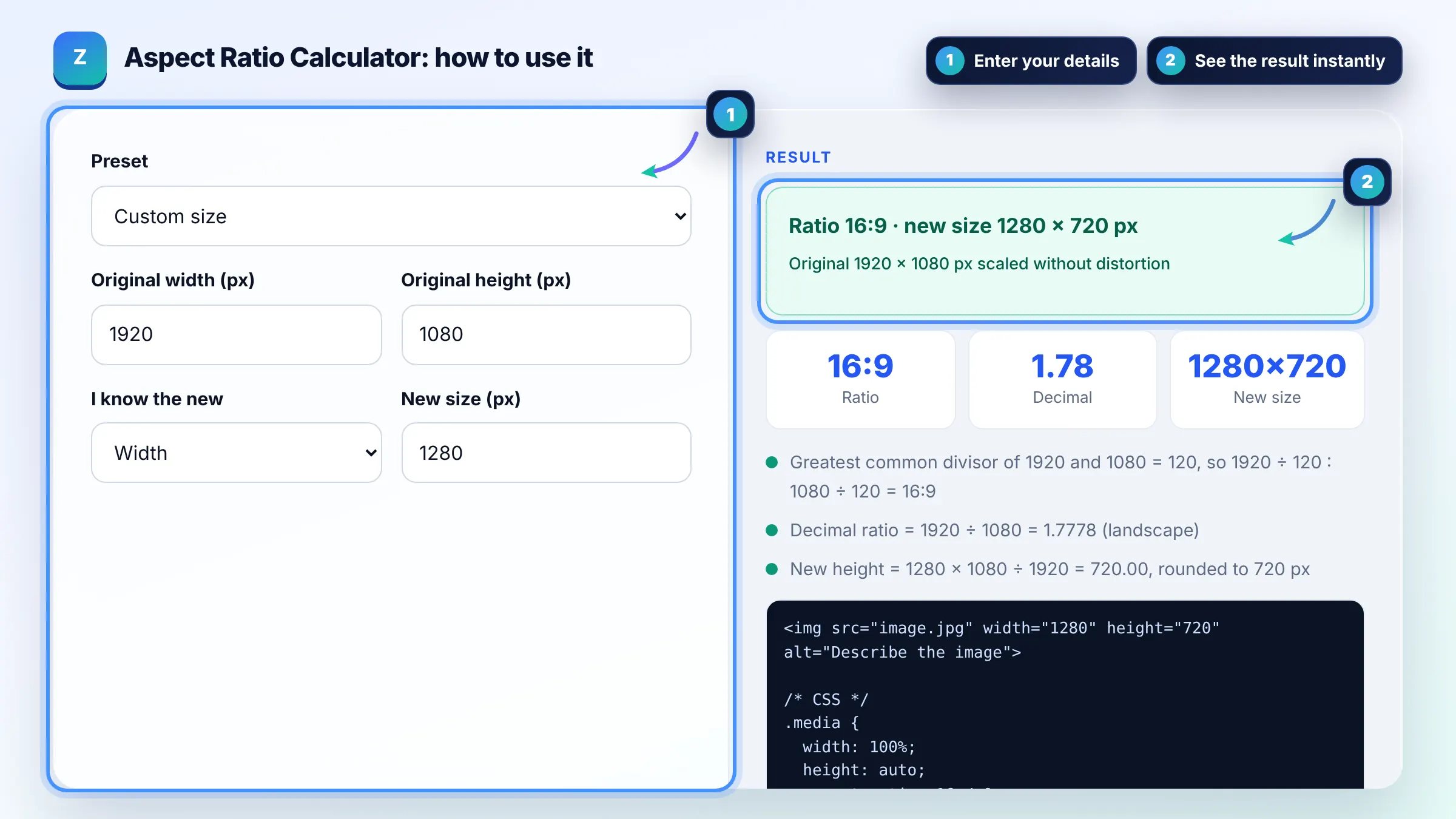
Divide width and height by their greatest common divisor: 1920 × 1080 divided by 120 is 16:9. For a decimal ratio, divide width by height, so 1920 ÷ 1080 = 1.78. In CSS you can apply it with the aspect-ratio property.
Keep the same ratio by calculating the second side: new height = new width × original height ÷ original width. A 1600 × 900 image resized to 800 wide must be 450 high. Changing only one side in an editor without locking the ratio causes distortion.
Width and height attributes let the browser reserve the right space before an image loads, which helps prevent layout shift. web.dev recommends always including them on images and videos, and layout stability is part of Core Web Vitals.
| Ratio | Common sizes | Typical use |
|---|---|---|
| 16:9 | 1920 × 1080, 1280 × 720 | YouTube video, hero images |
| 1.91:1 | 1200 × 628 | Open Graph and link preview images |
| 4:3 | 1024 × 768, 800 × 600 | Older screens, some blog images |
| 1:1 | 1080 × 1080 | Square social posts, product images |
| 9:16 | 1080 × 1920 | Stories, Shorts and Reels |
| 3:2 | 1500 × 1000 | Photography, DSLR images |
Example: a 1920 × 1080 banner has a greatest common divisor of 120, so the ratio is 1920 ÷ 120 : 1080 ÷ 120 = 16:9 (1.78). To fit a 1280 pixel wide column, new height = 1280 × 1080 ÷ 1920 = 720, so export it at 1280 × 720.
Aspect ratio is the proportional relationship between width and height, written as width:height. A 16:9 image is 16 units wide for every 9 units high, whatever its actual size in pixels.
1366 × 768 simplifies to 683:384, which is about 1.78, very close to 16:9. The calculator shows the exact simplified ratio and the nearest common ratio for sizes like this that do not divide evenly.
Many sites use 16:9 or 3:2 for featured images, and 1.91:1 at 1200 × 628 pixels for social sharing images. Pick one ratio for all featured images so your layout stays consistent across the site.
Divide the first number by the second. 16:9 is 16 ÷ 9 = 1.78, 4:3 is 1.33 and 1:1 is 1.00. A decimal above 1 means landscape and below 1 means portrait.
Yes. The missing dimension is rounded to the nearest whole pixel because images cannot have fractional pixels. Rounding can change the ratio very slightly, which is normal and not visible to users.
Add aspect-ratio: 16 / 9 to the element and set only its width, and the browser calculates the height. For images, setting the width and height attributes in HTML gives the browser the same ratio automatically.
Facts checked against these official pages. Read how I check facts in my editorial policy.
An open graph preview is a mockup of the link card social platforms build from your Open Graph meta tags. The…
A px to rem converter is a calculator that turns absolute CSS pixels into relative rem units. The formula is…
An image file name generator is a tool that converts a plain description into a file name that describes the…
Send your website and I will check it for you, free.
One short email when something new goes live: articles, free SEO tools, package updates, discounts and price alerts. No spam, unsubscribe in one click.