Color Contrast Checker
A color contrast checker is a tool that compares the relative luminance of two colors. The ratio is (L1 +…
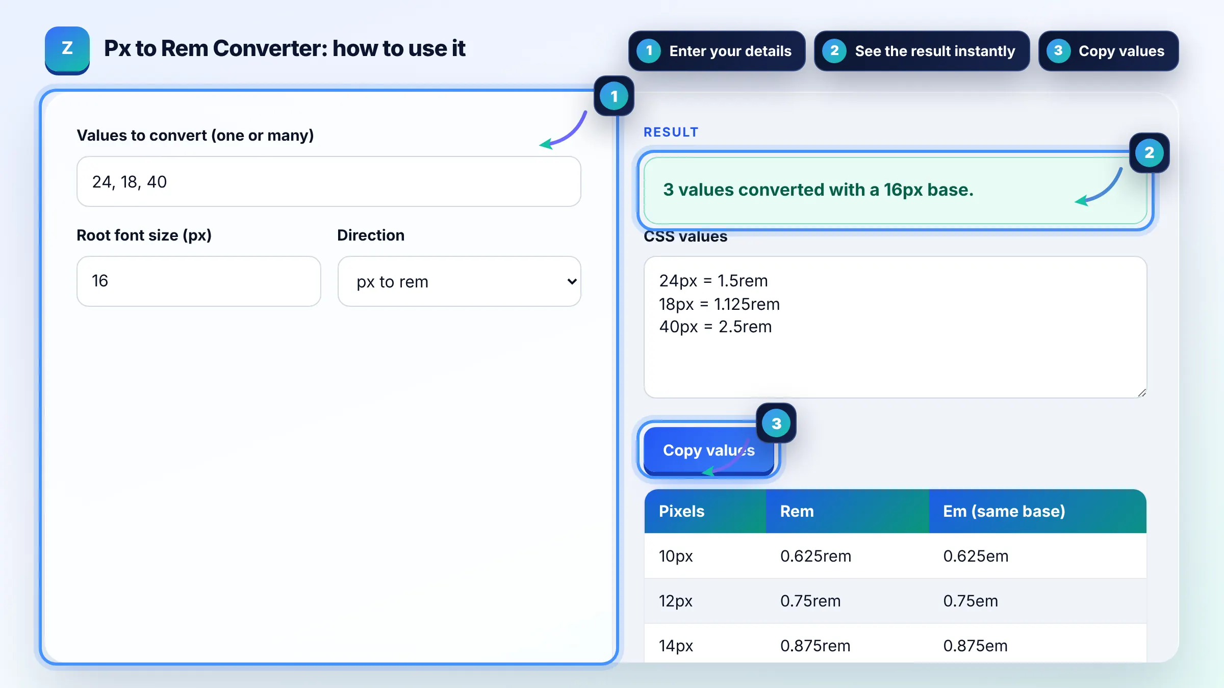
Convert pixels to rem and em, or rem back to px, using your own root font size.
| Pixels | Rem | Em (same base) |
|---|
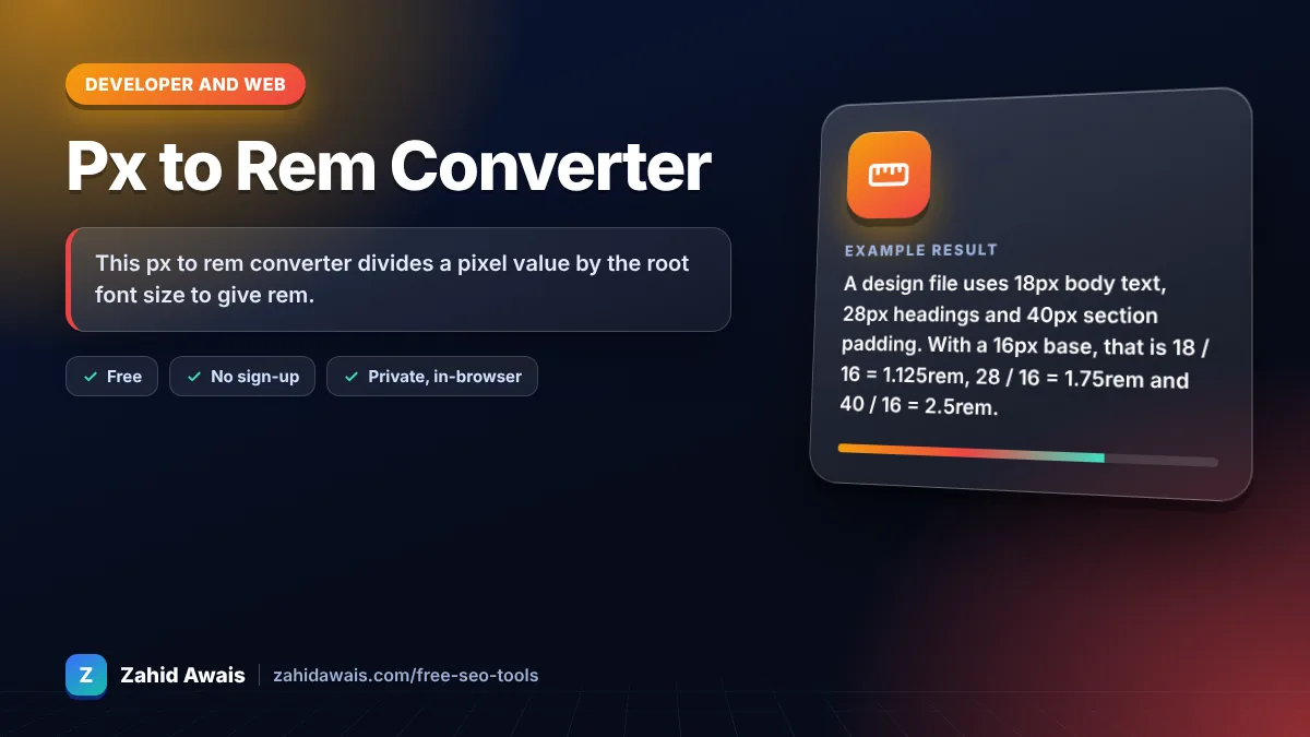
The free px to rem runs in your browser, needs no sign-up and never sends what you type anywhere.
This px to rem converter divides a pixel value by the root font size to give rem. With the common browser default of 16px, 24px equals 1.5rem and 1rem equals 16px. Rule of thumb: use rem for font sizes and spacing so text scales when a visitor changes their browser font setting.
A px to rem converter is a calculator that turns absolute CSS pixels into relative rem units. The formula is rem = px / base font size, and px = rem x base font size; em uses the same formula but with the parent element's font size as the base.
1rem equals 16px in most browsers because 16px is the common default root font size. If a visitor raises their default font size, or your CSS sets html { font-size } to another value, 1rem changes with it. See MDN's CSS length reference.
Use rem for font sizes in most cases, because rem respects the user's browser font size preference while px ignores it. Pixels are still fine for borders, shadows and small details that should not scale. Many design systems set type and spacing in rem and keep 1px borders.
Rem is relative to the root html element, while em is relative to the font size of the current element's parent. Rem gives predictable sizes anywhere on the page. Em compounds when elements are nested, which is useful for components that should scale with their own text.
| Pixels | Rem (base 16px) | Typical use |
|---|---|---|
| 12px | 0.75rem | Small labels and captions |
| 14px | 0.875rem | Secondary text |
| 16px | 1rem | Body text |
| 20px | 1.25rem | Large body or H4 |
| 24px | 1.5rem | H3 and card titles |
| 32px | 2rem | H2 and section headings |
Example: a design file uses 18px body text, 28px headings and 40px section padding. With a 16px base, that is 18 / 16 = 1.125rem, 28 / 16 = 1.75rem and 40 / 16 = 2.5rem. If the root is set to 10px, the same values become 1.8rem, 2.8rem and 4rem.
Setting the root to 62.5% makes 1rem equal 10px in a default browser, so 24px becomes 2.4rem and the maths is easier. It still respects user settings because it is a percentage. Remember to reset body text to 1.6rem or similar.
Rem units do not directly affect rankings. They help accessibility and readable mobile layouts, and readable text supports a good page experience for visitors. Rem also makes it easier to keep font sizes and spacing consistent across every breakpoint.
Multiply the rem value by the root font size. With a 16px base, 1.5rem is 24px and 0.875rem is 14px. Switch this tool to rem to px mode to convert a full list of rem values at once.
Yes. In media queries, rem and em are based on the browser's initial font size, not on your html font-size rule, so 48rem usually means 768px. Using em or rem breakpoints lets layouts adapt when users zoom text.
Three or four decimals is enough. Browsers round to fractions of a pixel, so 0.8125rem (13px) is exact while 0.333333rem adds nothing useful. This tool trims trailing zeros and keeps up to four decimals.
Yes. The conversion runs in your browser with plain JavaScript and nothing is sent to any server. You can paste a full list of values from a design handoff without it being stored or tracked.
Facts checked against these official pages. Read how I check facts in my editorial policy.
A color contrast checker is a tool that compares the relative luminance of two colors. The ratio is (L1 +…
An aspect ratio calculator is a tool that simplifies width and height into a ratio such as 16:9 by dividing…
A CSS minifier is a tool that rewrites a stylesheet into the smallest equivalent text. It protects strings…
Send your website and I will check it for you, free.
One short email when something new goes live: articles, free SEO tools, package updates, discounts and price alerts. No spam, unsubscribe in one click.