Website design and WordPress SEO
WordPress Staging Site Noindex: 4 Ways to Keep Google Out
Password protection, noindex headers and the Discourage setting compared, plus how to clean up a staging site that already leaked.
Read article
This guide is for site owners, designers and WordPress developers who want pages that fit every screen with less CSS to maintain. You will learn how to write responsive CSS without media queries using clamp() for sizes and CSS grid for layouts, how to keep fluid text accessible, and when a media query is still the right tool.
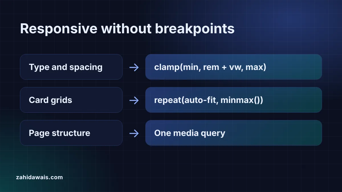
You can write responsive CSS without media queries by letting values scale on their own. Use clamp() so font sizes and spacing grow between a minimum and a maximum, and grid columns written as repeat(auto-fit, minmax(200px, 1fr)) so cards wrap to new rows. Keep media queries for big layout changes, such as moving a sidebar.
Yes, for most of the small adjustments that used to need breakpoints. A media query switches values at fixed widths, so a heading jumps from 28px to 36px at 768px. Intrinsic CSS lets the browser work the value out for every width instead: a clamp() value grows in a straight line between two sizes, and an auto-fit grid adds or removes columns as space allows. Fewer breakpoints means less CSS to test and fewer awkward in-between widths.
It does not remove media queries completely. Changing the order of content, hiding a menu behind a button or moving a sidebar under the main content are structural changes, and they still read best as a media query. The table shows which job each technique covers.
| Technique | What it replaces | Example | Still use a media query when |
|---|---|---|---|
| clamp() for font sizes | Font size breakpoints | clamp(1rem, 0.8333rem + 0.8333vw, 1.5rem) | Text must jump to a very different style |
| clamp() for spacing | Padding and gap breakpoints | padding: clamp(1rem, 5vw, 4rem) | Rarely |
| repeat(auto-fit, minmax()) | Column count breakpoints for cards | repeat(auto-fit, minmax(200px, 1fr)) | Items need a fixed column count |
| grid-template-areas | Float and position layouts | “header header” “sidebar main” | Areas must move, such as the sidebar on phones |
clamp() takes a minimum, a preferred value and a maximum, and the browser uses the preferred value only while it stays between the two limits. MDN describes clamp() as a function that “clamps a value within a range of values between a defined minimum bound and a maximum bound”, resolved as max(MIN, min(VAL, MAX)), and lists it as widely available across browsers since July 2020.
For fluid type, the preferred value mixes a rem part and a vw part, for example clamp(1rem, 0.8333rem + 0.8333vw, 1.5rem) for 16px on a 320px screen growing to 24px on a 1280px screen. The vw number is the slope of the line and the rem number is where the line starts. Working these out by hand is easy to get wrong, so the CSS clamp generator does the math, converts it to rem with your root font size and lets you drag a slider to see the size at any width. The same value works for padding, margins and gaps, so whole sections can breathe on big screens without a breakpoint.
It can be, but only if the text still grows when people zoom. WCAG success criterion 1.4.4 requires that “text can be resized without assistive technology up to 200 percent without loss of content or functionality”. The W3C failure technique F94 warns that viewport units “cannot be resized by zooming or adjusting text-size”, so a font size written in vw alone is a likely failure.
In a clamp() value, the rem limits and the rem part still grow with zoom, while the vw part does not. The result is text that grows, but less than the zoom level. For 16px to 24px between 320px and 1280px, 200% zoom on a 1280px screen makes the text only 1.5556 times larger, and it fully doubles at 280% zoom. Two habits help: keep the vw part small by using a modest size range, and write the limits in rem, as MDN’s accessibility note asks for “a relative length unit”. Then test the real page at 200% zoom.
A grid written as repeat(auto-fit, minmax(200px, 1fr)) creates as many columns of at least 200px as fit, and shares any spare space between them. MDN’s repeat() reference explains that auto-fit “behaves the same as auto-fill, except that after placing the grid items any empty repeated tracks are collapsed”. That collapse is why three cards in a wide row stretch to fill it instead of leaving empty columns.
minmax() sets the range. MDN notes that fr units are valid only as the maximum, so minmax(200px, 1fr) works and minmax(1fr, 200px) does not. Choose a minimum smaller than the narrowest screen you support, or the single column will overflow on small phones. The CSS grid generator writes this pattern when you tick Responsive columns and shows the result in a live preview.
You need one when the structure of the page should change, not only its sizes. A layout built with grid-template-areas has a fixed number of columns, and MDN says the cells of each named area must form a rectangle, “unless those cells form a rectangle, the declaration is invalid”. To move a sidebar below the main content on phones, you write a second set of area strings inside one media query. That is still far less CSS than a breakpoint for every font size and gap.
A practical split for most business sites: clamp() for type and spacing, auto-fit grids for cards, product lists and logos, and one or two media queries for the header and the main page layout. If you build on WordPress, these rules fit in a child theme or the Additional CSS panel, and my WordPress website design work uses the same approach. To size other parts of the page in rem, the px to rem converter saves time.
Example: a services page has a section heading and a row of service cards. The heading uses clamp(1.75rem, 1.3333rem + 2.0833vw, 3rem), which is 28px on a 320px screen, 37.33px at 768px and 48px from 1280px up. The cards sit in a grid with repeat(auto-fit, minmax(200px, 1fr)) and a 16px gap. In a 1000px wide container, 4 columns of at least 200px fit, so 3 cards stretch across 3 columns of 322.67px each because the empty fourth track collapses. In a 328px container on a phone, the cards stack in 1 column. The clamp generator flags the heading: it doubles only at 325% zoom, so the designer narrows the range to 28px to 40px and tests the page at 200% zoom.
No. Replace them one at a time where a fluid value does the same job, starting with font sizes and gaps. Keep the queries that change page structure, and check each page at phone, tablet and desktop widths after every change.
Yes, in all current major browsers. MDN marks clamp() as widely available and says it has worked across browsers since July 2020, so old browser fallbacks are only needed if your audience uses very outdated software.
No. The W3C failure technique F94 says text sized only with viewport units cannot be resized by zooming. Always combine vw with a rem part and rem limits inside clamp(), then test the page at 200% browser zoom.
Both create as many columns as fit. With auto-fit, empty columns collapse so the items stretch across the row. With auto-fill, the empty columns stay, so items keep their minimum size and leave space at the end.
Yes. Paste clamp() values and grid rules into a child theme stylesheet or the Additional CSS panel, and the HTML into a Custom HTML block. Check the result at phone, tablet and desktop widths after you save.
There is no fixed number. With fluid type, fluid spacing and wrapping grids, many small business sites need only a few, mostly for the header navigation and the main page layout. Test at real phone, tablet and desktop widths.
This guide is part of my Core Web Vitals guide.
Checked 23 Oct 2026. Facts checked against these official pages. Read how I check facts in my editorial policy.
Want a responsive site built for you? See my website design service.
Password protection, noindex headers and the Discourage setting compared, plus how to clean up a staging site that already leaked.
Read article
Thirty practical checks I run on every new WordPress site, grouped so you can fix the biggest risks first.
Read article
Every check I run before, during and after a site move, including the monitoring weeks most guides ignore.
Read articleSend your website and I will reply with a free audit.