CSS Clamp Generator
Builds a fluid clamp() font size from min and max sizes and widths, with a zoom check.
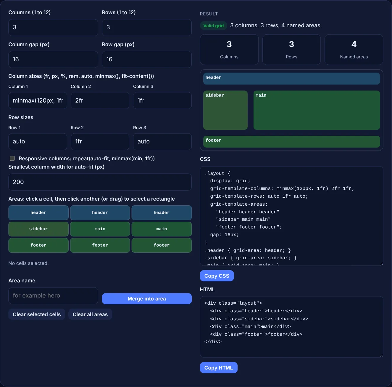
Set the columns, rows and gaps, click or drag across cells to make named areas, and copy clean grid CSS and HTML.
No cells selected.
The free CSS grid generator lets you build a page layout visually: set columns, rows and gaps, merge cells into named areas by clicking or dragging, and copy the grid-template CSS and matching HTML. A live preview shows the layout as you change it.
A CSS grid generator writes the display: grid code for a layout. You choose column and row sizes such as 1fr, 200px or minmax(120px, 1fr), set the gap, and name areas like header, sidebar and main. The tool outputs grid-template-columns, grid-template-rows and grid-template-areas plus HTML, checking that every area is a rectangle.
A CSS grid generator is a visual editor that turns a layout you draw into CSS grid code. Instead of typing track lists and area strings by hand, you set the number of columns and rows, give each track a size and select cells to form areas. The tool writes the grid-template-columns, grid-template-rows, grid-template-areas and gap lines, one grid-area rule per area and the HTML elements to match.
Named areas make layouts easy to read. MDN explains that grid-template-areas "specifies named grid areas, establishing the cells in the grid and assigning them names". Each quoted string is one row, each word is one cell, and a dot marks an empty cell. MDN lists the property as widely available across browsers since October 2017.
Because CSS grid only accepts rectangular named areas, and a layout with an L shaped or split area is ignored. MDN states that cells with the same name create a single area, and "unless those cells form a rectangle, the declaration is invalid". When a browser drops an invalid grid-template-areas declaration, the whole set of areas is lost, not only the broken one. The tool prevents this: when a merge would leave another area in an L shape, it removes that area and tells you, so the output is always valid.
Both repeat a column as many times as fits the container, but auto-fit collapses the empty columns and auto-fill keeps them. MDN's repeat() reference says auto-fit "behaves the same as auto-fill, except that after placing the grid items any empty repeated tracks are collapsed". With repeat(auto-fit, minmax(200px, 1fr)), three cards in a wide container stretch to share the width. With auto-fill they keep their size and leave empty columns at the end.
minmax(min, max) gives a track a size range: it never gets smaller than the first value or larger than the second. MDN notes that fr units are only allowed as the maximum, and that if the maximum is smaller than the minimum, the maximum is ignored. That is why minmax(120px, 1fr) is valid but minmax(1fr, 200px) is not, and the tool marks the second as an invalid track size. Combining minmax() with auto-fit creates columns that wrap to new rows without a single media query.
| Track size | What it means | Good for |
|---|---|---|
| 1fr | One share of the free space | Main content columns |
| 240px | A fixed width | Sidebars and navigation |
| auto | Sized by the content, can stretch | Header and footer rows |
| minmax(120px, 1fr) | At least 120px, at most one share | Columns that must not get too narrow |
| fit-content(300px) | Content size, capped at 300px | Labels and short text |
| repeat(auto-fit, minmax(200px, 1fr)) | As many 200px+ columns as fit | Card grids without media queries |
Example: the default layout has 3 columns sized minmax(120px, 1fr) 2fr 1fr, rows auto 1fr auto and a 16px gap. It has 4 named areas: header across the top, sidebar and main in the middle row, and footer across the bottom, so the result reads "Valid grid". If you press Clear all areas, click the first cell, click the cell in row 2, column 2, name it hero, merge, then set 4 columns and a 24px row gap, the CSS shows "hero hero . ." on the first two rows, the column list minmax(120px, 1fr) 2fr 1fr 1fr and gap: 24px 16px.
MDN lists grid-template-areas and minmax() as widely available, working across browsers since October 2017. Any up to date version of Chrome, Edge, Firefox or Safari will show the layout as the preview does, so old browser fallbacks are rarely needed.
Yes, for card grids. Tick Responsive columns and the tool writes repeat(auto-fit, minmax(200px, 1fr)), so columns wrap when the screen gets narrow. Fixed area layouts still need a media query or a second set of areas for phones.
Named areas map to a fixed number of columns, while auto-fit changes the column count with the container width. The tool therefore leaves the areas out in auto-fit mode and outputs numbered items instead. Untick the option to get them back.
Paste the CSS into Additional CSS in the Customizer or your theme stylesheet, and the HTML into a Custom HTML block. Put your own content inside each area element. Rename the layout class if your theme already uses it.
Use names that start with a letter, with only letters, digits, hyphens and underscores, such as header or main-nav. Spaces and names that start with a digit are rejected, and keywords like auto and span are blocked.
No. The generator runs fully in your browser with JavaScript and nothing is sent anywhere. Copy the CSS and HTML before you close the page, because the tool does not store your layout.
Checked 23 Oct 2026. Facts checked against these official pages. Read how I check facts in my editorial policy.
Builds a fluid clamp() font size from min and max sizes and widths, with a zoom check.
A box shadow generator is a visual tool that writes the CSS box-shadow value for you. The browser draws a…
An aspect ratio calculator is a tool that simplifies width and height into a ratio such as 16:9 by dividing…
A border radius generator is a visual tool that turns four corner values into one border-radius rule. Each…
Send your website and I will check it for you, free.
One short email when something new goes live: articles, free SEO tools, package updates, discounts and price alerts. No spam, unsubscribe in one click.