CSS Grid Generator
Visual grid builder: tracks, gaps, auto-fit and named areas, with CSS and HTML output.
Enter the smallest and largest size and the screen widths where they apply, and get a fluid clamp() value you can paste into your CSS.
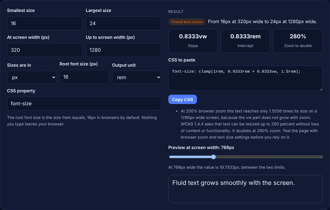
The root font size is the size 1rem equals, 16px in browsers by default. Nothing you type leaves your browser.
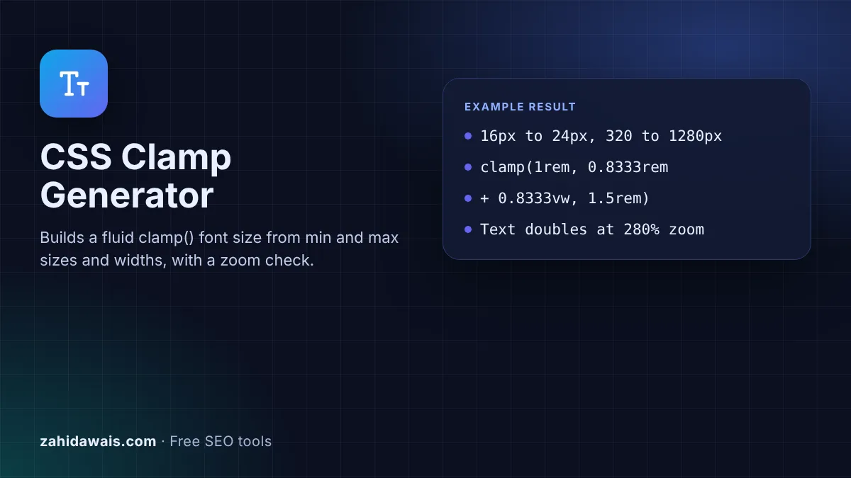
The free CSS clamp generator turns a smallest size, a largest size and the two screen widths where they apply into one fluid clamp() value. It shows the slope and intercept, previews the text at any width and checks how the result behaves with browser zoom.
A CSS clamp() value for fluid type has three parts: a minimum, a preferred value made of a rem part plus a vw part, and a maximum. The tool works out the vw slope and rem intercept so the size grows in a straight line between two screen widths, then stays fixed outside them.
A CSS clamp generator is a calculator that writes a clamp() value for you, so a font size, margin or gap scales smoothly with the screen instead of jumping at breakpoints. MDN describes the function plainly: clamp() "clamps a value within a range of values between a defined minimum bound and a maximum bound", and it is resolved as max(MIN, min(VAL, MAX)).
The hard part is the middle value. To hit exactly 16px at 320px wide and 24px at 1280px wide, you need a straight line through those two points. The slope is the size change divided by the width change, 8 divided by 960, which is 0.8333vw. The intercept is the size the line would have at 0px wide, 13.333px or 0.8333rem. The tool does this math, rounds to four decimals and converts to rem with your root font size.
The slope is (largest size minus smallest size) divided by (largest width minus smallest width), and the intercept is the smallest size minus the slope times the smallest width. Multiply the slope by 100 to get the vw number, because 1vw is 1% of the viewport width. Divide the intercept by the root font size to get rem. For 20px at 400px and 36px at 1200px, the slope is 16 / 800 = 0.02, which is 2vw, and the intercept is 20 minus 8 = 12px, or 0.75rem, so the value is clamp(1.25rem, 0.75rem + 2vw, 2.25rem).
It can, but you have to check it. WCAG success criterion 1.4.4 says that "text can be resized without assistive technology up to 200 percent without loss of content or functionality". The W3C failure technique F94 explains that viewport units "cannot be resized by zooming or adjusting text-size". In a clamp() value only the vw part has that problem, because the rem part and the limits still grow with zoom. The tool calculates the zoom level at which the text really doubles, at every width from 320px to 1920px, and warns when 200% is not enough. It is a calculation to guide you, not a full accessibility audit.
Use rem for the minimum and maximum of text sizes. MDN's accessibility note for clamp() says to "make sure that the maximum allowed value is a relative length unit", so that text can grow when the page is zoomed. Rem follows the root font size, so the value respects a visitor's browser font setting. Px output is still useful for spacing, borders and other values where you want a fixed scale. The tool lets you type in either unit and choose the output unit separately.
| Use | From / to | clamp() value |
|---|---|---|
| Body text | 16px to 18px | clamp(1rem, 0.9583rem + 0.2083vw, 1.125rem) |
| Small heading | 20px to 28px | clamp(1.25rem, 1.0833rem + 0.8333vw, 1.75rem) |
| Page heading | 28px to 48px | clamp(1.75rem, 1.3333rem + 2.0833vw, 3rem) |
| Section padding | 16px to 64px | clamp(1rem, 5vw, 4rem) |
Example: a site wants body text of 16px on a 320px phone and 24px on a 1280px laptop, with a 16px root font size. The tool outputs font-size: clamp(1rem, 0.8333rem + 0.8333vw, 1.5rem); with a slope of 0.8333vw and an intercept of 0.8333rem. With the preview slider at 768px the value is 19.7333px. The zoom check shows the text doubles at 280% zoom, because on a 1280px screen 200% zoom makes it only 1.5556 times larger, so the result reads "Check text resize". A smaller range helps: 16px to 18px over the same widths doubles at 218% zoom.
It keeps a value between a minimum and a maximum. The browser uses the preferred middle value while it sits between the two limits, and switches to the minimum or maximum when the preferred value goes past them. MDN lists it as widely available across browsers since July 2020.
Either the screen is outside the two widths you chose, so the minimum or maximum applies, or the vw part is very small. Drag the preview slider between your two widths and the size should change at every step.
Yes. clamp() works with any property that takes a length. Change the CSS property box to padding, margin or gap and the tool writes the same fluid value for it. Spacing does not need the text resize check, so you can ignore that warning.
Then the value should shrink as the screen grows, for example a large heading on phones. The tool puts the smaller number first and uses a negative vw part, because clamp() with a larger minimum than maximum always returns the minimum.
Enter 16 unless your CSS sets a different font size on the html element. Browsers use 16px by default, and 1rem equals the root font size. If you set html to 62.5%, enter 10 so the rem numbers match your site.
No. The generator runs entirely in your browser with JavaScript, including the preview and the zoom calculation. Nothing is uploaded or stored, so you can use it on client projects safely.
Checked 23 Oct 2026. Facts checked against these official pages. Read how I check facts in my editorial policy.
Visual grid builder: tracks, gaps, auto-fit and named areas, with CSS and HTML output.
A px to rem converter is a calculator that turns absolute CSS pixels into relative rem units. The formula is…
A box shadow generator is a visual tool that writes the CSS box-shadow value for you. The browser draws a…
Send your website and I will check it for you, free.
One short email when something new goes live: articles, free SEO tools, package updates, discounts and price alerts. No spam, unsubscribe in one click.